01 / Strategy · Discovery · Marketplace
Turning sitter discovery into conversion
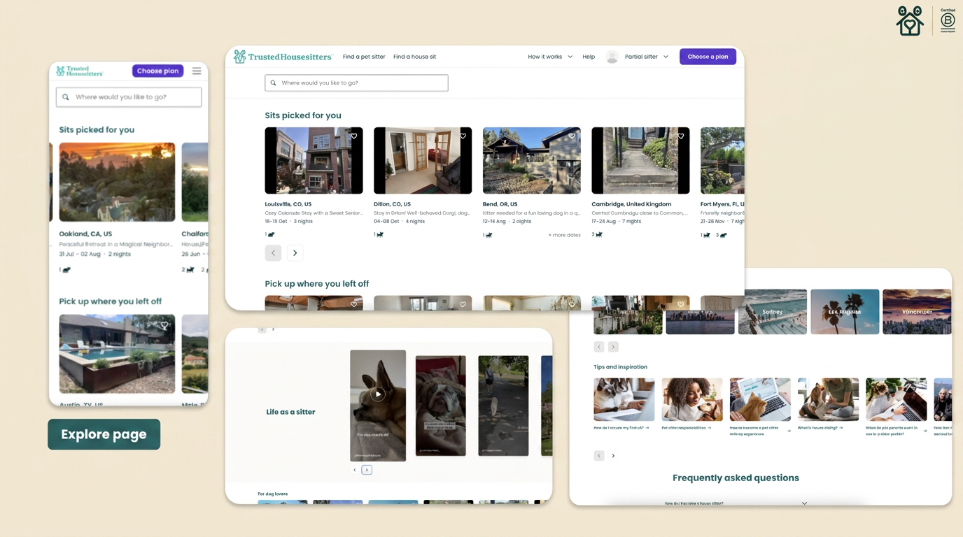
Prospective sitters were being asked to make decisions before they had seen enough of the marketplace to know whether membership was worth it. I led a shift from a restrictive journey to personalised discovery, resulting in a 40% uplift in conversion and a new Explore experience across web and app.
01
The challenge
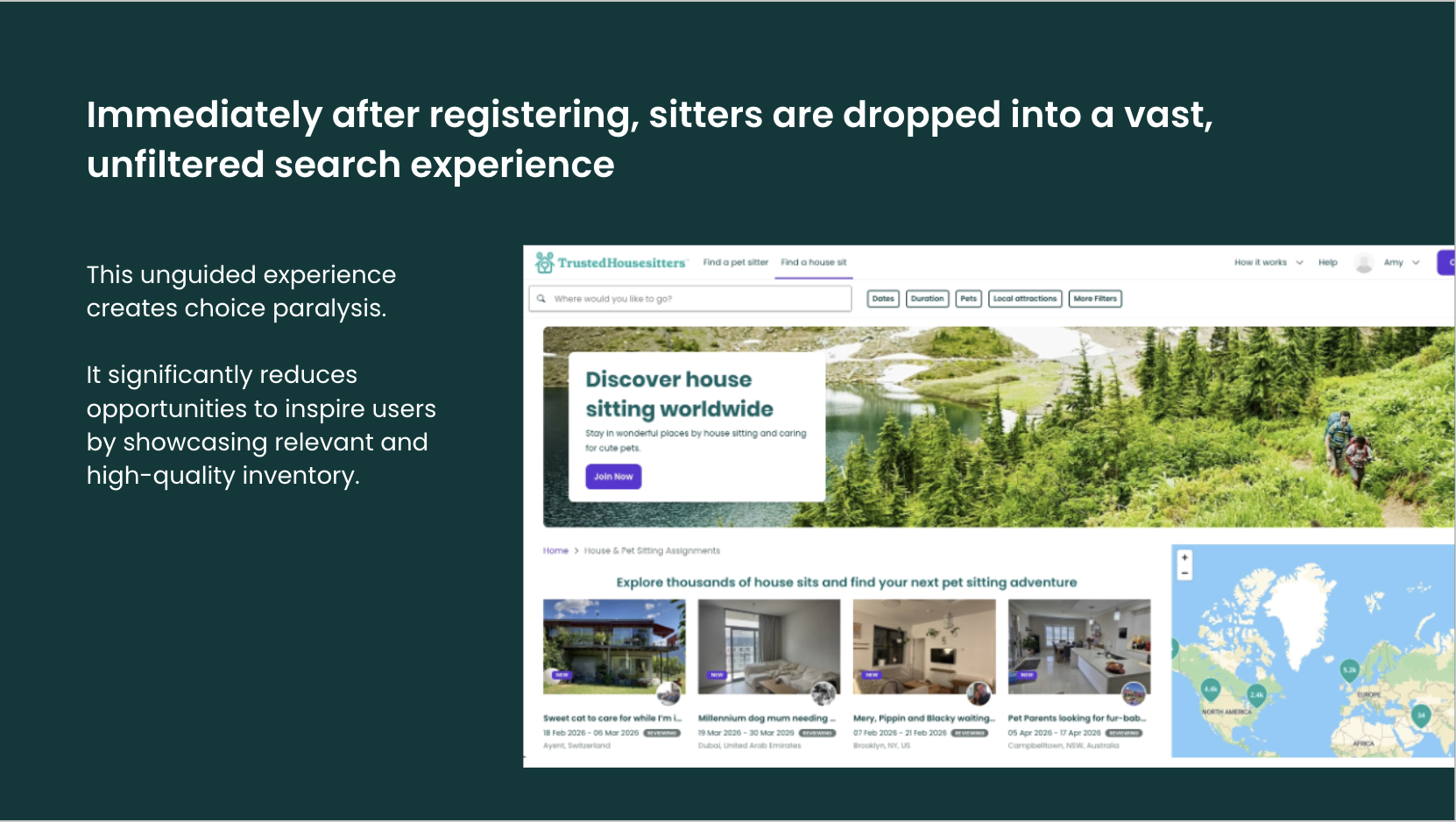
Sitter acquisition was down 12% year on year and conversion was slowing. The experience also made it hard for prospective sitters to understand the value of the marketplace before being asked to commit. After registering, people completed a short preference wizard and were then dropped into a broad, open-ended search experience. This relied on sitters already knowing where and when they wanted to travel, even though many build intent by seeing appealing opportunities. The data showed that discovery quality directly affected conversion. People who repeatedly encountered limited search results were around 23% less likely to convert, while an earlier experiment that exposed users to richer inventory increased conversion by 60%. The opportunity was not simply to improve checkout. We needed to help sitters experience enough value to want membership in the first place.
02
Testing our first assumption
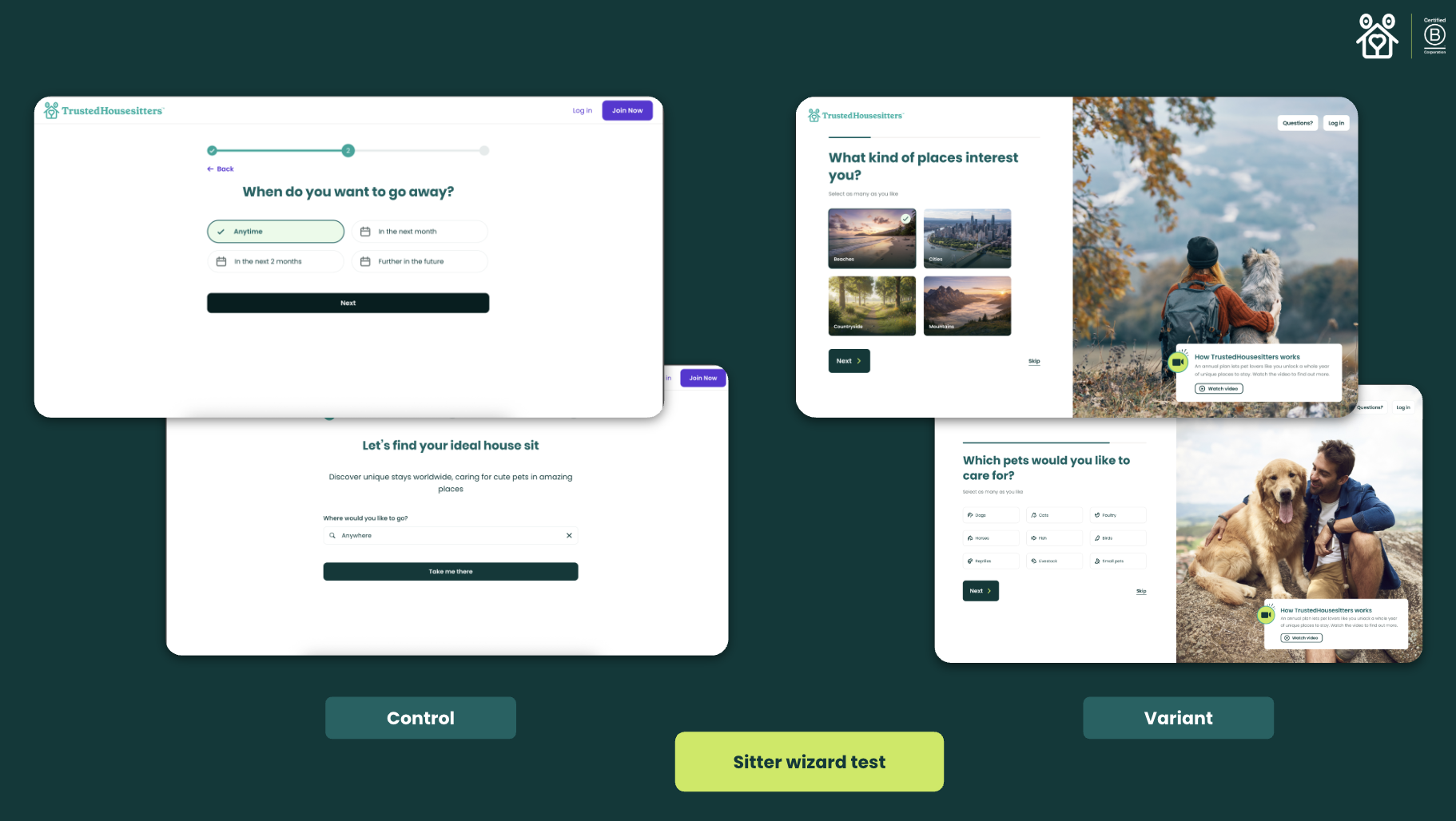
We initially believed that collecting more preferences would help us create a more relevant journey. I designed two new versions of the sitter wizard and worked with the team to test them. Neither version beat control. The biggest drop-off remained at the first preference question, where people were asked to choose the types of places they liked before seeing any real sits. This challenged a central assumption in the original direction. Sitters did not always arrive with fixed preferences. In many cases, seeing an exciting opportunity helped them discover what they wanted. Rather than continuing to optimise the wizard, we stopped and changed direction. Removing it as the default route meant all partial sitters could reach the inventory, instead of only the 85% who completed the previous journey.
03
Reframing the strategy
I reframed the problem around progressive discovery: show people the value of the marketplace earlier, personalise what they see and remove unnecessary barriers between interest and inventory. The strategy brought together three areas of opportunity: personalised exploration, less gated discovery and a stronger connection between web and app. This supported a journey where sitters could understand the proposition, explore relevant opportunities and build commitment over time. 'Explore' became the main product expression of that strategy. Instead of sending people into an empty search or directly to pricing, it gave them a guided place to browse and build intent.
04
Designing personalised discovery
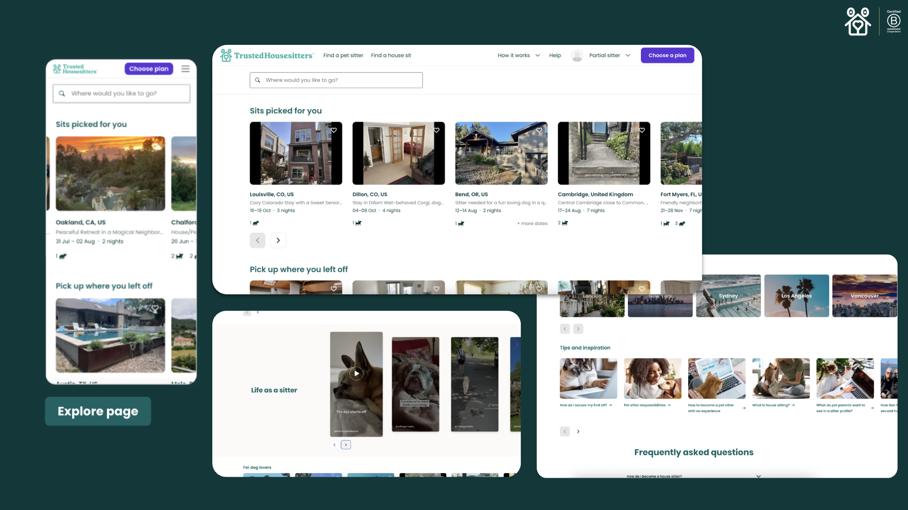
Explore was not a static landing page. Its content changed based on who the sitter was, what we knew about them and which high-quality inventory was available. The primary Sits picked for you carousel uses AWS personalisation technology. Returning users could receive recommendations informed by previous behaviour, while cold-start support helped us serve relevant inventory to people with limited interaction history. Other carousels used marketplace and behavioural signals such as listing recency, start date, duration, pet type, reviews and recently viewed sits. This meant a new sitter might see latest sits, coastal escapes or first-time-friendly opportunities, while a returning sitter could pick up where they left off or see recommendations shaped by previous browsing. The page aimed to show around seven useful rows per session. I defined quality thresholds and fallback logic so weak or sparse carousels were hidden rather than filling the page with low-value inventory. The composition of the page could therefore adapt to both the user and the changing supply in the marketplace.
05
Rollout and impact
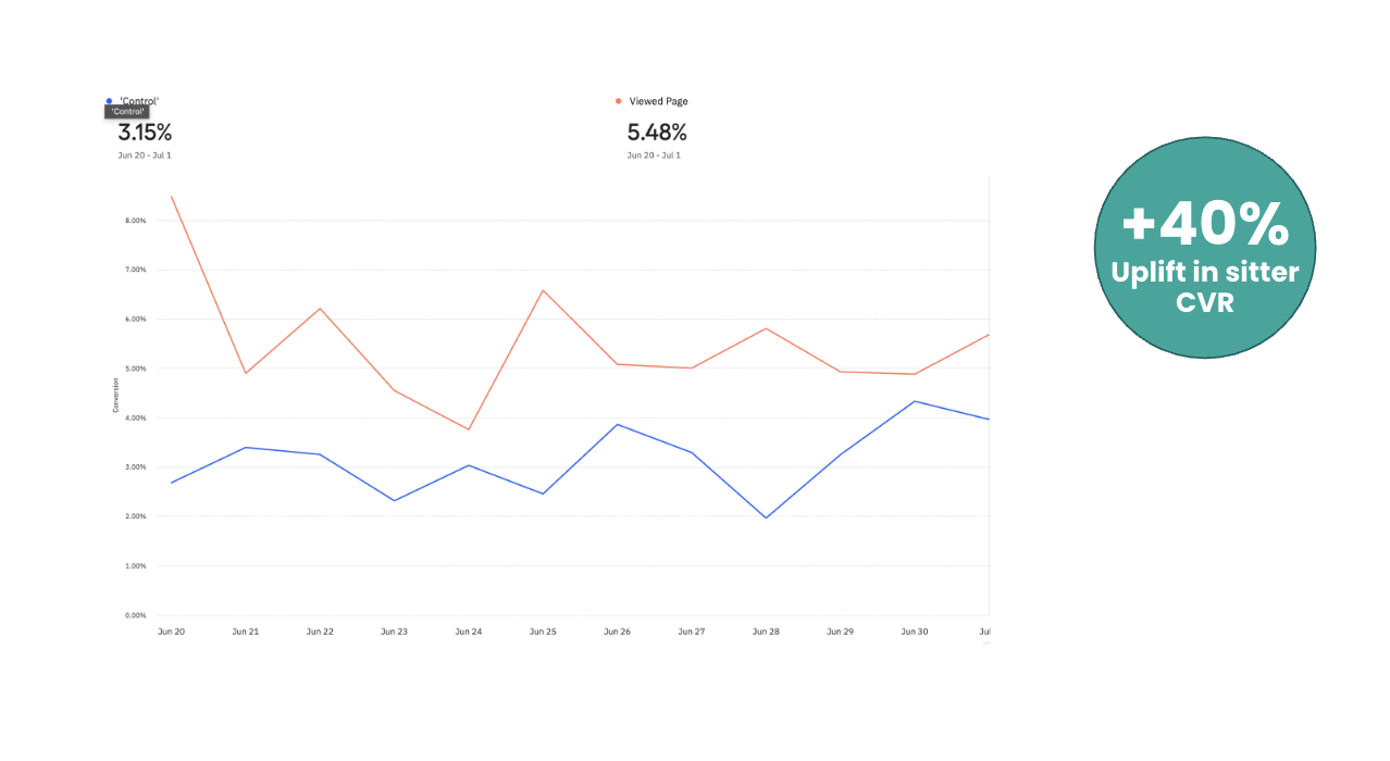
A clean A/B test was difficult because Explore affected multiple user types, entry routes and sessions. We chose a staged rollout so we could take a meaningful product risk and learn from real behaviour quickly. We first released the page to 50% of relevant users, then expanded the rollout while retaining a 5% global holdout. Early web results showed a 40% uplift in seven-day sitter conversion for people who viewed Explore. This was a strong enough signal to support a wider web rollout and further investment in the experience.
06
Expanding across the journey
Following the web rollout, we adapted Explore for the app. This created a stronger foundation for repeat discovery, favourites, saved searches and continued engagement as users built confidence in the marketplace. The recommendation capability also became useful beyond the page itself, supporting personalised inventory in CRM campaigns. Explore was becoming more than a destination: it was creating a reusable discovery and matching layer across product and marketing. Our next focus is visibility. The experience performs well when people reach it, so we are increasing the number of routes into Explore and continuing to improve the carousel mix and recommendation model.
07
Outcomes
The failed wizard strengthened the project because it helped us separate the strategy from the first solution. The goal of making discovery more relevant remained right, but compulsory preference collection was not the best way to achieve it. The work also demonstrated that discovery can create intent. People do not always know exactly what they want at the start of a journey, but the right opportunity can help them recognise it. Most importantly, discovery and conversion were not separate problems. Helping sitters browse relevant, desirable inventory was how we helped them understand the value of membership.
Next case study — 02
Exploring the future of discovery with Natural Language Search